Interiors have become such a passion of mine. For years, when I was raising three little kids, I didn’t have a single second to think about the design of my house. But now, as the kids are getting older (my twins will be seniors in high school!!!) I’m finding more time for the ways I can express myself through our home’s decor.
I decided to work on improving our house room by room because a full top-to-bottom reno wasn’t in the cards (or the budget). Since the kitchen is so lovely now (my friend Zoe Feldman designed it last summer), I got started on the rest of the main floor — converting a TV room to a bedroom, a full bathroom and a powder room.
It’s finally complete now, and I learned so much in the process. Here are a few tricks I picked up along the way. I hope you love it as much as I do!
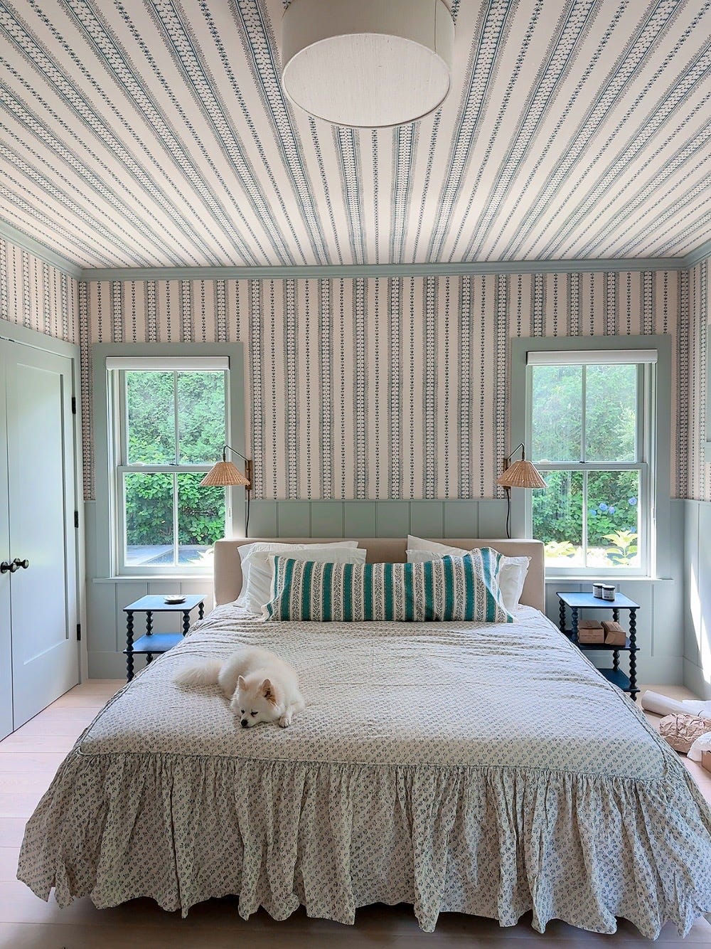
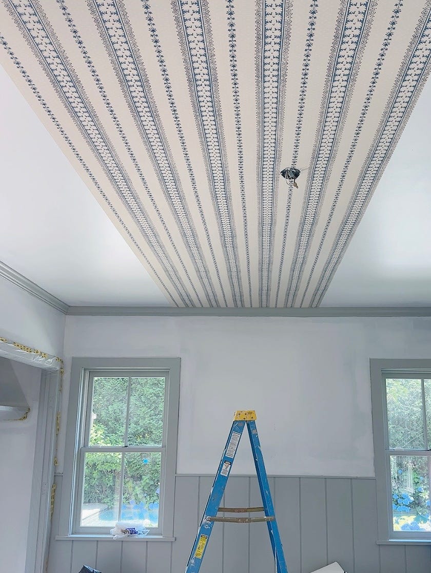
1. The impact of wallpaper on the ceiling
So many of my saved inspo images featured this design element, and I’d been wanting to try it myself. I chose a beautiful stripe by Alice Sergeant. I love stripes, and the blue felt so soothing and beachy. I found the paper at Temple Studio, my friend Kate Temple’s amazing showroom. If you are ever looking for the most gorgeous fabrics and wallpapers, make an appointment to visit Kate. She reps all of my favorite lines (including the LR wallpaper and interior fabric line we launched last year).
Matching the pattern on the ceiling and walls was a bit tricky. I had a hard time deciding which direction to place the stripe, and we had a last-minute kerfuffle once we realized the wall behind my bed (between two windows) wasn’t centered in the room. My amazing wallpaper hanger assured me I wouldn’t notice that it’s slightly off. Spoiler alert: I notice! But it’s ok.
All in all, I am just so pleased with the final product.
2. All-over patterned rooms
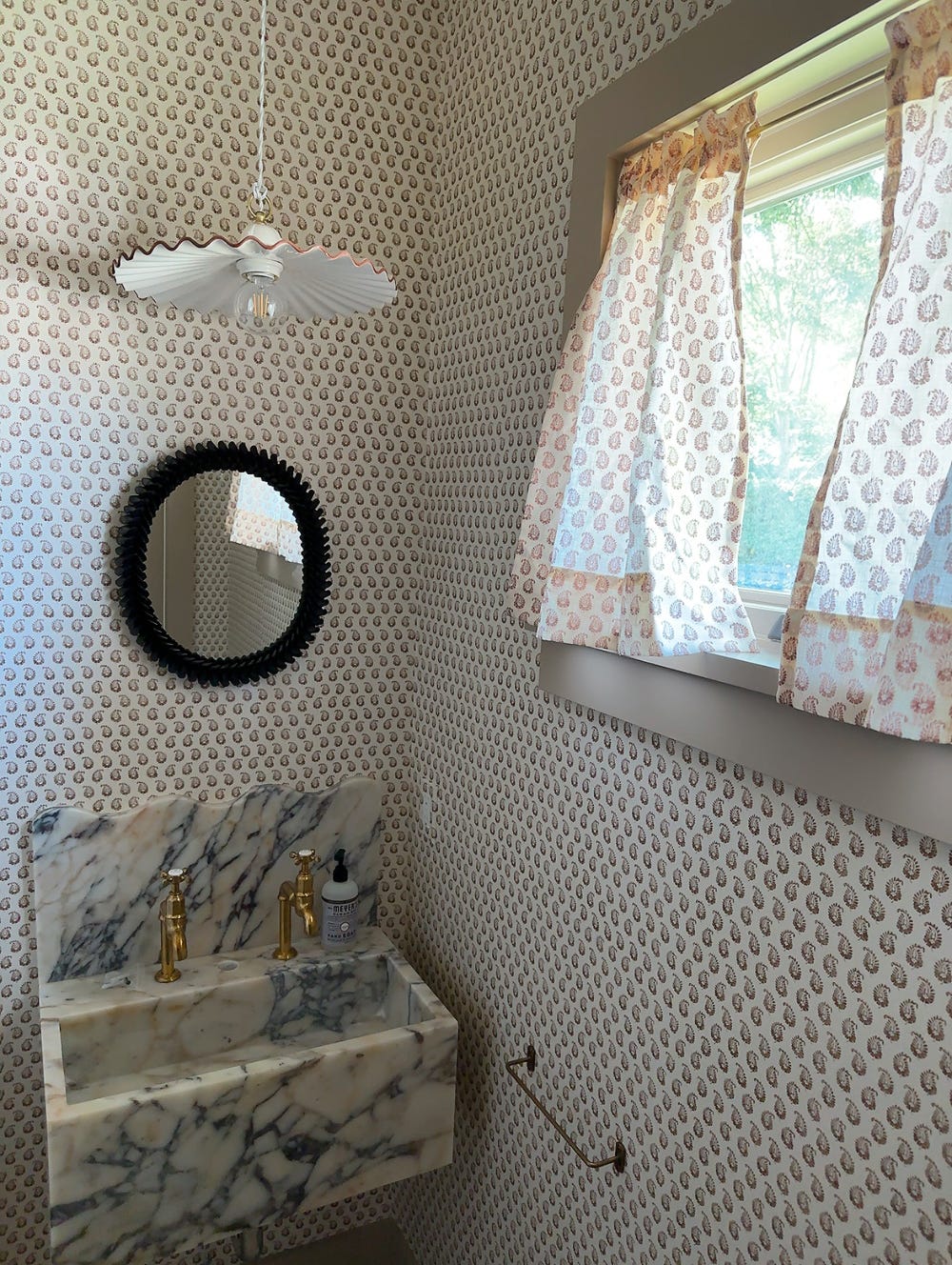
I have been loving the look of rooms with the same pattern on every surface. Originally, I wanted to use the Alice Sergeant paper in what was then going to be a TV room and reupholster our giant couch in matching fabric. But the upholsterer said I needed 50 yards (!) of fabric and that was WAY out of my budget. So I decided to do this one pattern look in the small powder room instead.
I chose one of my favorite patterns from Howe at 36 Bourne Street, a delicate brown paisley called Cyprus Linen in Cocoa. What I love about their collection is that it is super tight! There are very few choices. It’s like 4 patterns and each only comes in 1 or 2 colors. It’s so decisive and confident.
I got to visit 36 Bourne Street when I was last in London. Look how pretty it is! (Also if you ever want to go, it’s easy to remember their address).
3. Saving money by sewing myself
I decided to hand-sew the curtains and a skirt for the sink to save money. And also because I love to make things. The rod from Fog Linen happened to fit perfectly into my little window.
I was winging it when it came to the sink skirt, making the pattern up as I went along. I gathered the fabric and sewed it onto a flat swathe of fabric. I sewed the soft side of Velcro onto the skirt itself and then got sticky-back rigid Velcro for under the sink. The sink is quite thick underneath and the proportions are a bit wonky but I like it! If I ever want to change it out, Phil, my long-suffering contractor, says we can probably rig a system to attach rods to the sink somehow.
4. Customizing my sink on Etsy
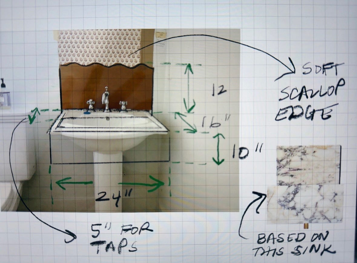
Etsy is my best resource for special things that don’t cost a lot. I found a marble sink manufacturer in Turkey and asked if I could customize the shape of the backsplash to be a soft scallop. I made a paper mockup of the exact curve I wanted, added a ledge at the back for soap, and created a spec to send to the vendor. About a month later a giant crate arrived with my sink inside. I’m so pleased with it and love the Violetta marble I chose, too.
5. The wonder that is Procreate
Speaking of specing sinks — I recently learned how to use Procreate software on my iPad. My knowledge of Procreate is very rudimentary but I make it work. I love that you can set a grid guide on your project. And you can hold your finger down to make any line perfectly straight. It’s been such a useful tool for my interior projects. I loved it so much I hired a teacher to come teach the program to my design team and they use it all the time now.
6. Adding little things that have a huge impact
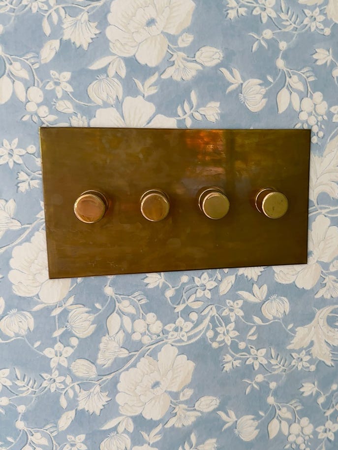
Little details make such a difference to the final result. I’m still waiting for my brass switch plates to arrive from deVOL, but they are going to take the level of polish up a notch.
I had these switch plates installed in my kitchen and every time I turn on a light I smile.
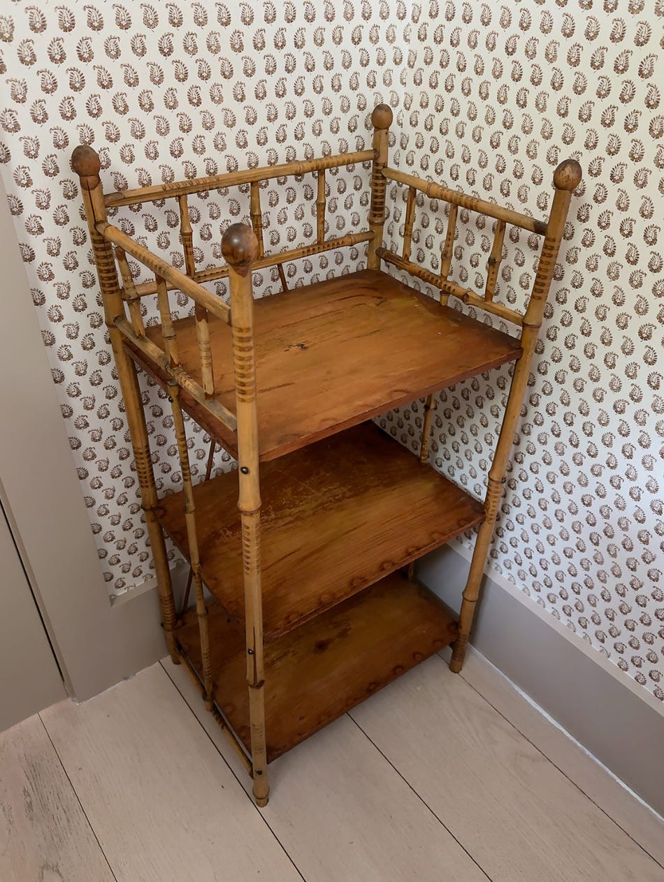
I purchased an antique bamboo shelf at Sage Street Antiques for my powder room. Still need to put more stuff on it but it is useful and pretty.
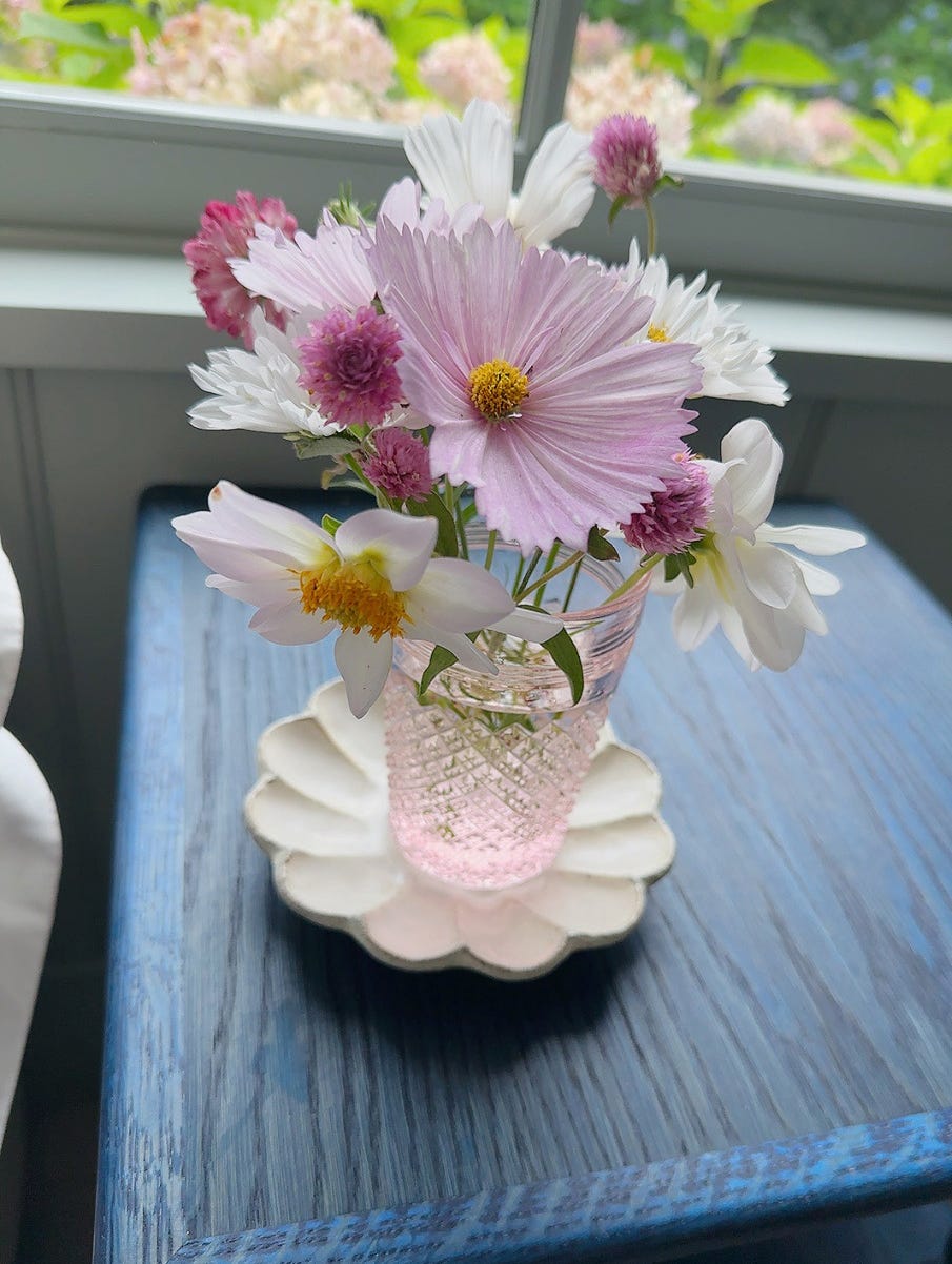
These are flowers from my garden that I put by my husband’s side of the bed. The bedside bobbin tables are by Alfred Newall.
Other little things that make a big impact: the pulls on my vanity, the bedspread on my bed, a sweet pastel painting I got at a vintage store hanging on my wall.
7. Zellige tile is so special
Originally my plan was to clean up and update my bathroom in a small way. But then I realized that even making small changes in the bathroom would still cost a lot of money. And if I was spending the money, I might as well end up with a bathroom I absolutely love. I went back to Jaime at Mosaic House and decided to do the whole bathroom in Zellige tile. I chose a subtle color (I kind of wish I had gone for something crazier, but alas…). The entire shower, floor and wall paneling are Zellige. I love how it complements the room’s hardware, shown above with the beautiful brass sink I found on Etsy.
I chose to use a “butt seam” placement instead of a set spacing between tiles. It looks more organic that way. It’s so earthy and beautiful and special.
Zellige tiles are definitely worth the investment. Plus, the tiles remind me of my travels to Morocco and that puts a big smile on my face.
8. Vintage accents are everything
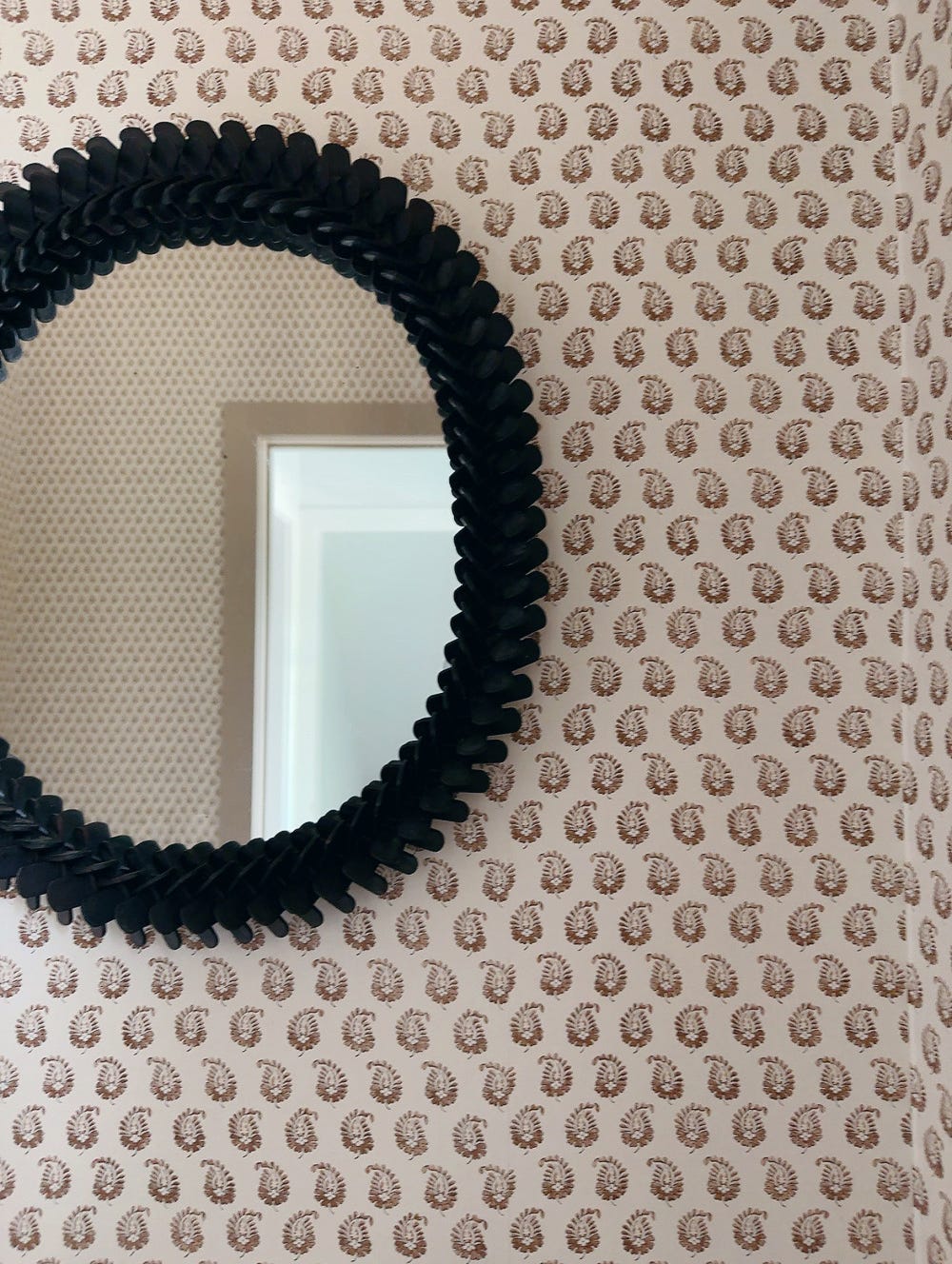
Vintage pieces are such special elements because no one else on earth will have the same design. I was absolutely thrilled when I found this mirror at Sage Street Antiques for $80. It completely makes the bathroom.
9. The importance of a view
The design of a room isn’t just about the room, but also about the view from inside, especially in a place that’s so much about nature. In moving downstairs, we lost the expansive view from our upstairs window, and I thought long and hard about how to add something just as beautiful to my new room. I put in my flower garden and little flower boxes full of my favorite red geraniums, both visible from my bed.
Resources I Love:
Antiques: Beall and Bell, Litten Tree Antiques, Sage Street Antiques
Bedding: Les Indiennes
Brass Fixtures & Plumbing: deVOL, Samuel Heath, Fog Linen
Curtains & Rods: East London Cloth
Décor Items: Nickey Kehoe
Lighting: Soane Britain (my lights are not Soane but I wish they were), Laurie Lamps
Wallpaper: Alice Sergeant, Howe at 36 Bourne Street
Interior Designers: Zoe Feldman, Studio Faeger., Beata Heuman, Basic Projects
…And one thing I hate:*
I’m bummed that I haven’t found great bathroom hooks and rods. Fog Linen makes nice ones but they aren’t the most sturdy. I really struggled to find good hooks and the little hardware pieces needed for a functional bathroom. Any ideas? I bought my toilet paper holders from Rowan and Wren, a company in the UK that makes pretty things. The holders are fine but not my dream.
*my husband suggested that I always include one thing I don’t like at the end. Ha!







jessie! this is as inspiring as it is practical — making it an authentic reflection of you and your voice, style, and talent. chef's kiss to the 'one thing i hate' per brian. brava!
welcome to substack! so glad you are here. love all of this advice. also, your sink is incredible - I cannot believe it was an Etsy find!